Senin, 30 Agustus 2010

Beatles Album Sleeves

Whatever your opinion of the music The Beatles made, I reckon there's no denying they had some great Album Sleeve designs - remember this is the 1960's and  maybe the high point of  Sleeve design - the 12" format allowing for rather more input that a CD Cover (actually the last one tipped into the 70's, and is the worst of them). The Beatles made twelve studio albums in the seven years they were together, which is some going in itself. Here are the Sleeve designs in chronological order:

1963 Please Please Me

1963 With the Beatles

1964 A Hard Day’s Night

1964 Beatles For Sale

1965 Help

1965 Rubber Soul

1966 Revolver

1967 Sgt Pepper’s Lonely Hearts Club Band

1968 The Beatles [White Album]

1969 Yellow Submarine

1969 Abbey Road

1970 Let It Be

Jumat, 27 Agustus 2010

Motel Postcards

The third and final part of my look at the nostalgic era of American Motels features American linen postcards. Linen postcards are easily identifiable by the type of high rag card stock they were printed on which was produced with a linen finish; a textured pattern distinguished by parallel and intersecting lines resembling linen cloth. The face of the card was the textured side and the reverse was smooth just like other postcards.
Due to the use of this paper, linen postcards could be printed with brighter inks creating brightly coloured images, making them a huge advancement over the earlier white border postcards. Linen postcards' heyday was from the 1930's when they were introduced to about 1945.
I have quite a collection of these linen postcards mainly featuring town views, ‘important’ buildings, and factories. I believe they are mainly heavily retouched black & white photographs, rendered in vibrant colours. This retouching gives then a unique look.


Kamis, 26 Agustus 2010

Classic Motels

Following on from my last post on American Motel Signs, here some examples of classic Motels:


Selasa, 24 Agustus 2010

Motel Signs

I've driven the length and breadth of California on two occasions, and of course managed to see but a fraction of it. It's a huge State, three times the size of the whole of Great Britain. As soon as you strike out east of Los Angeles, over the mountains, you realise that large tracts of the southern State are essentially desert, endless mile of the stuff.
I love it though - endless miles of highway disappearing toward some distant range of hills - you ARE in a movie. Now and then you come across a small wind-blown town that will have a truck stop, some dodgy eating houses, a junkyard, and smattering of Motels.
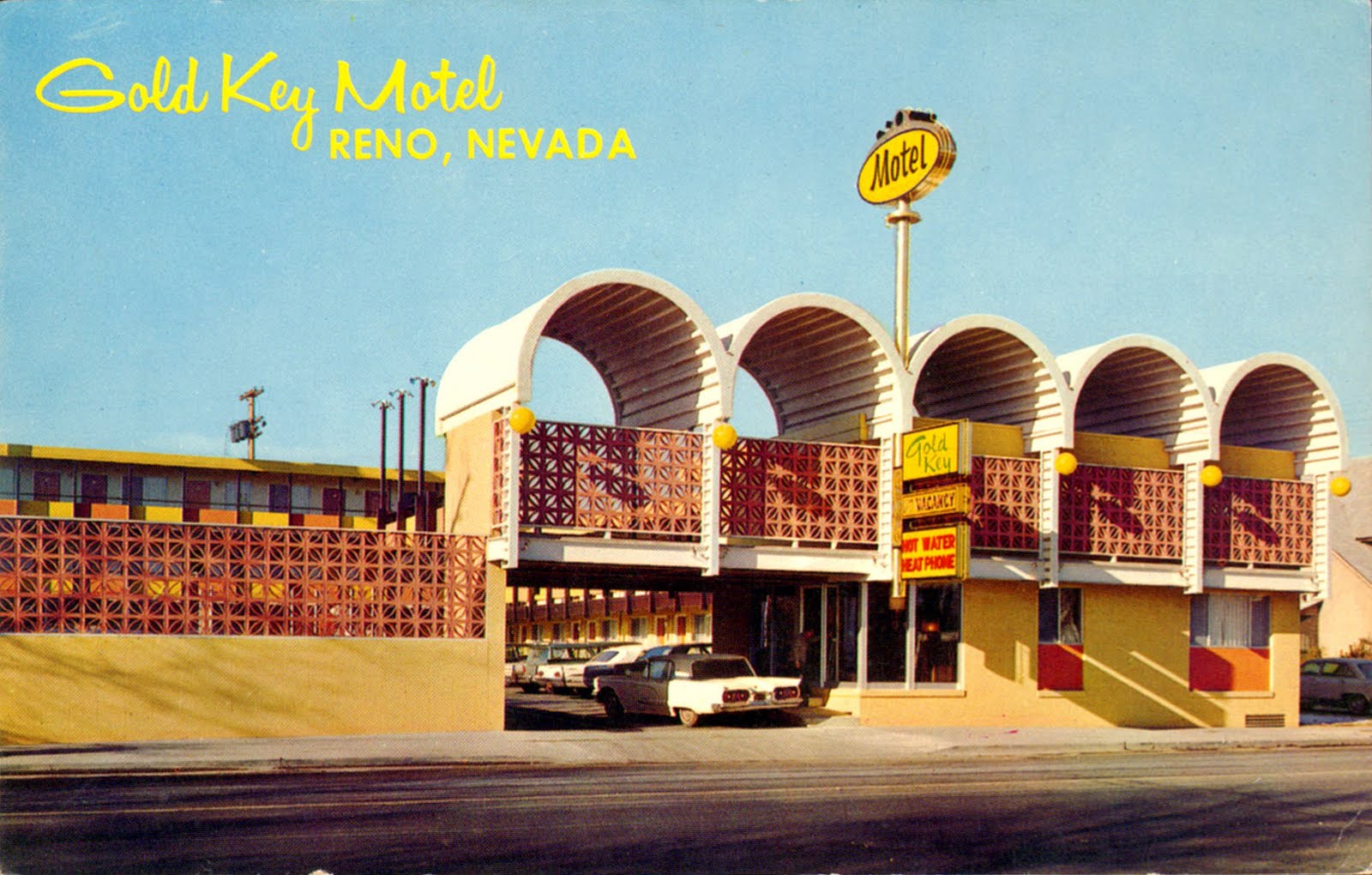
It's those huge old rusting Motel Signs that are so alien to our eyes, a real bit of America, and now sadly gradually disappearing from the landscape as the old motels close down. I think they're such an iconic part of the American landscape - I'm glad that some are now being preserved. Here are some examples:


Minggu, 22 Agustus 2010

Grant Wood

I love the paintings of Grant Wood. He was an American painter born in Anamosa, Iowa in 1891, famous for his depictions of the rural Midwest. His landscapes are nostalgic and carry a sense of what was once great about America - the pioneering spirit, love of the land and its place in history, sometimes actually depicting historical moments as in 'Paul Revere's Ride', the last image shown below. These paintings were certainly an early influence on my own approach to landscape painting.
They are gentle rolling landscapes, soft and curvy, and are places we all feel we'ed be comfortable in. Undoubtedly his most famous and iconic image of the American Midwest is 'American Gothic', depicting a dour farmer and his wife standing in front of their farmhouse. The portrait top left is a self-portrait. Grant Wood died in 1942.