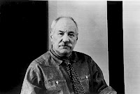
Julian Opie (born 1958) is a contemporary English artist. Julian Opie was born in London and raised in Oxford. He is a graduate of Goldsmiths College (1979-82) and achieved some early gallery success, which was an incentive for slightly younger artists in the same college, such as Damien Hirst to do likewise.
His highly stylised work, involves the reduction of photographs (or short films) into figurative reproductions (created using computer software). In his portraiture, the human face is characterised by black outlines with flat areas of colour, and minimalised detail, to the extent that an eye can become a just the black circle of the pupil, and sometimes a head is represented by a circle with a space where the neck would be. In this way, Julian Opie tries to present the complexities of the human form by reducing it to its mere basics.
I must say that on a more basic level his portraits of have always reminded me of Hergé’s Tintin cartoons! Hergé:
Opie:
Julian Opie's style was brought into the public eye when he was asked to design the cover for the British band, Blur's best of album. On the cover, the band members Graham Coxon, Alex James, Dave Rowntree and Damon Albarn are transformed into Opie's style. Here they are in that order:
Other portraits:
Sabtu, 31 Juli 2010
Kamis, 29 Juli 2010
Anna G & Alessandro M
There's nothing more pleasing around the kitchen than utensils made by the Italian company Alessi. From the 1980s onward, Alessi has been particularly associated with the notion of "designer" objects - otherwise ordinary tools and objects executed as high design, particularly in a post-modern mode, from designers such as Philippe Starck. Most of the memorable "designer kettles," "designer toothbrushes," "designer graters" and so on were Alessi products. For some years we've had an Alessi "Anna G" bottle opener and it's always a pleasure to use, and it works. I do think that the "Anna G" and (her husband) "Alessandro M" range are great fun.
Alessi was founded in 1921 to produce crafted products in metal for eating and drinking, by Giovanni Alessi. In 1935, Carlo Alessi (born 1916), son of Giovanni, was named chief designer. In 1945 he ascended to chief executive and designed the coffee service Bombé, an industrial piece manufactured in four sizes. That same year Carlo's younger brother, Ettore Alessi, joined the company as a technician.
By the 1980s, Alberto Alessi took over the management of Alessi (which he still does today) and launched the Alessi company into the design decade through collaborations with designers and architects such as Alessandro Mendini, Ettore Sottsass, Richard Sapper, and Achille Castiglioni.
Selasa, 27 Juli 2010
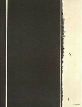
Stations of the Cross
In my last blog, about the paintings of Barnett Newman, I mentioned seeing the big retrospective of his work at Tate Modern in 2003. One complete room of that exhibition was given over to one body of his work, a series of fourteen paintings, 'The Stations of the Cross', that he worked on over a period of eight years - from 1958 to 1966, and is widely considered his greatest masterpiece. These are large scale monochromatic works. At the Tate show I thought they were the best thing. Sitting in the room in low lighting surrounded by those works was an incredibly calming experience; they were my favourite thing in the show.
According to the artist, the paintings are not intended to express the succession of events found in traditional depictions of the Stations of the Cross. Instead they reveal the single moment when Christ cried out 'God, why have you forsaken me?' - 'Lema sabachthani', the subtitle Newman gave to the series.
'It was while painting them that it came to me (I was on the fourth one) that I had something particular here,' Newman said. 'It was at that moment that the intensity that I felt the paintings had made me think of them as the Stations of the Cross.'
Newman had always defended the spiritual dimension of his work, and here, Christ's Passion becomes 'the cry of man, of every man', and perhaps a mirror of his own personal crisis. 'I tried to project something I felt was very real in relation to the Passion,' he said, 'and I feel that kind of suffering has gotten almost universal.' The series has also been interpreted as a memorial to the Holocaust and the tragedy of war.
According to the artist, the paintings are not intended to express the succession of events found in traditional depictions of the Stations of the Cross. Instead they reveal the single moment when Christ cried out 'God, why have you forsaken me?' - 'Lema sabachthani', the subtitle Newman gave to the series.
1st Station of the Cross
3rd Station of the Cross
'It was while painting them that it came to me (I was on the fourth one) that I had something particular here,' Newman said. 'It was at that moment that the intensity that I felt the paintings had made me think of them as the Stations of the Cross.'
4th Station of the Cross
5th Station of the Cross
Newman had always defended the spiritual dimension of his work, and here, Christ's Passion becomes 'the cry of man, of every man', and perhaps a mirror of his own personal crisis. 'I tried to project something I felt was very real in relation to the Passion,' he said, 'and I feel that kind of suffering has gotten almost universal.' The series has also been interpreted as a memorial to the Holocaust and the tragedy of war.
7th Station of the Cross
8th Station of the Cross
12th Station of the Cross
13th Station of the Cross
Minggu, 25 Juli 2010
Barnett Newman
Following my last post, on the abstract expressionist Mark Rothko, I thought I'd have a look at the work of another one, Barnett Newman. I hadn't seen Newman's paintings 'in the flesh' until Tate Modern put on a big retrospective back in 2003. I was knocked out by the power of these paintings - often on a very large scale, their mere size is the first impressive thing about them, but the strength of conviction and bravura in these deceptively simple works stays with you.
Barnett Newman 1905 – 1970 was an American artist. He is seen as one of the major figures in abstract expressionism and one of the foremost of the colour field painters.
He was born in New York, the son of Jewish immigrants from Russian Poland. He studied philosophy at the City College of New York and worked in his father's business manufacturing clothing. From the 1930s he made paintings, said to be in an expressionist style, but eventually destroyed all these works.
Throughout the 1940s he worked in a surrealist vein before developing his mature style. This is characterised by areas of colour separated by thin vertical lines, or ‘zips’ as Newman called them. In the first works featuring zips, the colour fields are variegated, but later the colours are pure and flat.
The zip remained a constant feature of Newman's work throughout his life. In some paintings of the 1950s, such as The Wild, which is eight feet tall by one and a half inches wide, the zip is all there is to the work.
Newman's late works, such as the Who's Afraid of Red, Yellow and Blue? series, use vibrant, pure colours, often on very large canvases - Anna's Light (1968), named in memory of his mother who had died in 1965, is his largest work, twenty-eight feet wide by nine feet tall.
Newman also worked on shaped canvases late in life, with Chartres and Jericho for example, being triangular.
Barnett Newman 1905 – 1970 was an American artist. He is seen as one of the major figures in abstract expressionism and one of the foremost of the colour field painters.
He was born in New York, the son of Jewish immigrants from Russian Poland. He studied philosophy at the City College of New York and worked in his father's business manufacturing clothing. From the 1930s he made paintings, said to be in an expressionist style, but eventually destroyed all these works.
Throughout the 1940s he worked in a surrealist vein before developing his mature style. This is characterised by areas of colour separated by thin vertical lines, or ‘zips’ as Newman called them. In the first works featuring zips, the colour fields are variegated, but later the colours are pure and flat.
The zip remained a constant feature of Newman's work throughout his life. In some paintings of the 1950s, such as The Wild, which is eight feet tall by one and a half inches wide, the zip is all there is to the work.
The Wild
Newman's late works, such as the Who's Afraid of Red, Yellow and Blue? series, use vibrant, pure colours, often on very large canvases - Anna's Light (1968), named in memory of his mother who had died in 1965, is his largest work, twenty-eight feet wide by nine feet tall.
Two paintings from Who's Afraid of Red, Yellow and Blue? series
Anna's Light
Newman also worked on shaped canvases late in life, with Chartres and Jericho for example, being triangular.
Chartres
Jericho
Jumat, 23 Juli 2010
Mark Rothko
One of my favourite painters is the abstract expressionist Mark Rothko. I love the big bold interpretation of colour and the way the paint is applied. Born in Dvinsk, Russia (now Daugavpils, Latvia) in 1903 Rothko moved with his family to Portland, Oregon in 1913. His painting education was brief - he moved to New York to study under the artist Max Weber and then struck out on his own.
Rothko is known for his abstract expressionism paintings, but he moved through more traditional styles in his early career, including Surrealist paintings in the 1940s. In 1947 he embarked on the first of his large abstract 'colour-field' paintings, formalising their structure further in the 1950s.
Rothko had huge success with large-scale solo shows, but committed suicide in 1970. Rothko’s assistant, found the artist in his kitchen, lying dead on the floor in front of the sink, covered in blood. He had sliced his arms with a razor found lying at his side. During autopsy it was discovered he had also overdosed on anti-depressants. He was 66 years old.
Langganan:
Komentar (Atom)


